What is Warming stripes?
Source: “Warming stripes” From Wikipedia
Source: “open source” climate science
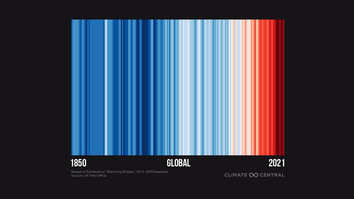
Warming stripes are data visualization graphics that use a series of coloured stripes chronologically ordered to visually portray long-term temperature trends.Warming stripes reflect a “minimalist” style, conceived to use colour alone to avoid technical distractions and intuitively convey global warming trends to non-scientists.
“I wanted to communicate temperature changes in a way that was simple and intuitive, removing all the distractions of standard climate graphics so that the long-term trends and variations in temperature are crystal clear. Our visual system will do the interpretation of the stripes without us even thinking about it.” — Ed Hawkins, May 2018